Students learn math via advanced math comic-books. Although the parent company (Art of Problem Solving) has been around for nearly 20 years, Beast Academy Online was launched in 2016. Comic books and online labs and puzzles are what is offered. Define the brand guide and manage/maintain.
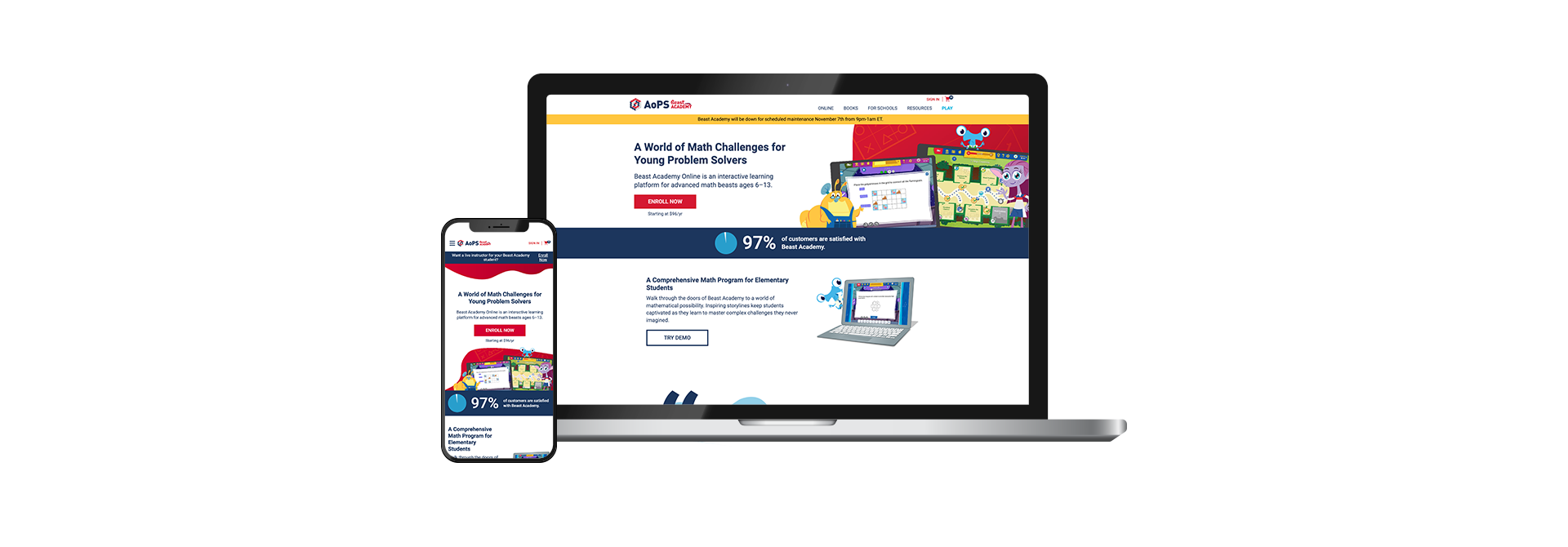
Showcasing the beasts and their personalities in all different mediums to help solidify the brand. Getting the beasts into the fabric of AoPS Beast Academy and into various marketing channels. On the web, making sure the homepage alone had the essence of the beasts and their vibrant and zest for problem solving and learning. Wireframe prototypes were created in Adobe XD. Continuing that through to social media, amazon gift cards and packaging tape.

Through researching, I found that internal stakeholders and their users want purchasing products and online courses to be simple. Users also prioritize finding the right level program for their student (number does not always correlate to current grade).

Meeting with the BA product owners helped me better understand their highest priorities for the BA website. They were:
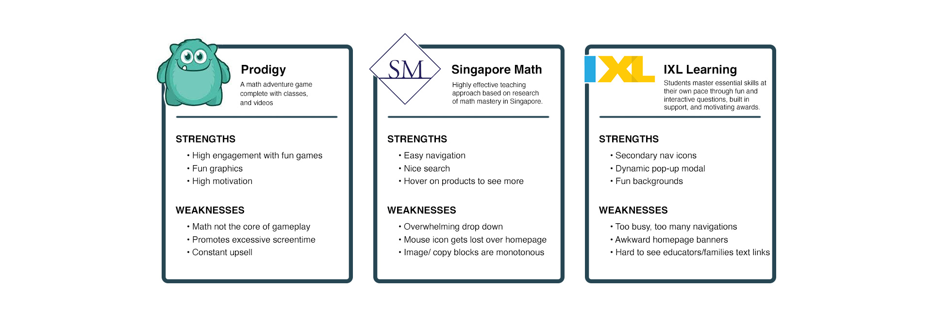
After analyzing what these do well, I wanted to make sure I incorporated some of those features in the redesign. The following features were:
To better understand Beast Academy users’ most prominent needs and pain points when using the current website, I conducted user interviews and usability testing. In these interviews, I had users go through the process of the Beast Academy checkout flow, add one student and purchase at least one product.
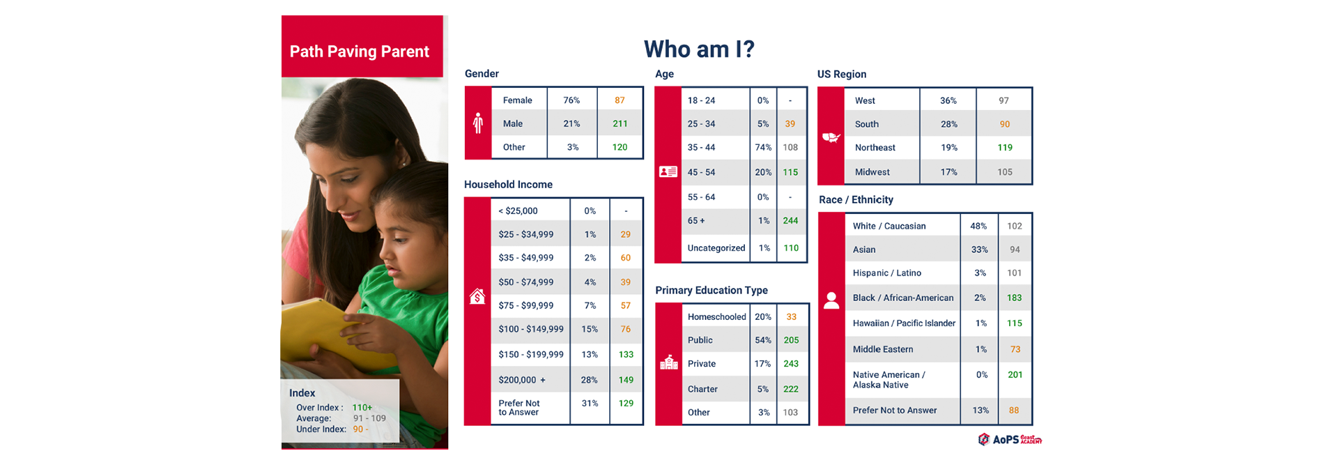
Through our in-house marketing research, we found that our main client client is the “path-paving parent”, moms 24-35 yrs old who are very involved in their child’s education and want the best for them.
Once I identified users' pain points and client's priorities, I began to organize the layout of the Beast Academy website. Ultimately ensuring needs were met for both.
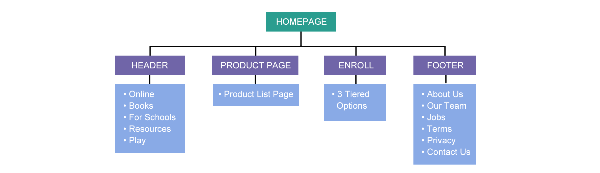
I first built out the site map. This gives me the confidence I need that this website has the necessary pages and layout to allow users to purchase BA products in an efficient and intuitive way.
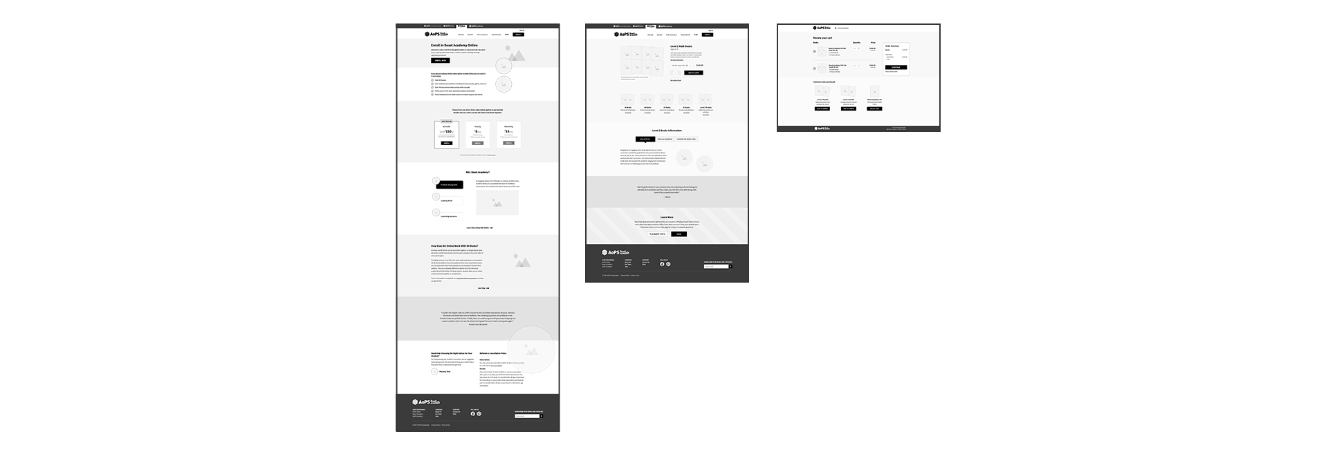
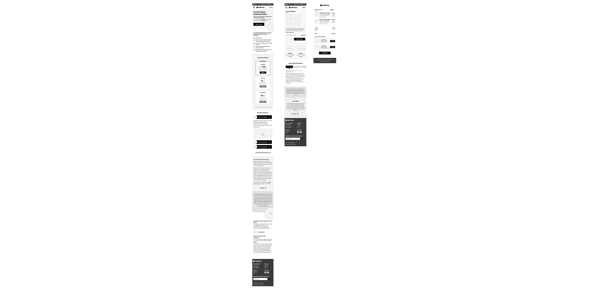
We began creating mid-fidelity desktop and mobile website wireframes which include layouts and features to allow the user a carefree purchasing experience.
A few key features included in these wireframes were:
Same features added.
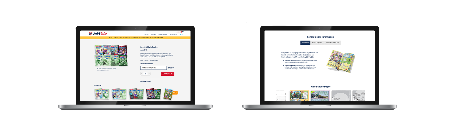

Desktop prototype was built and tested with users, it was found that users could easily purchase items, add students and continue shopping using the pop-up modal and rest of the site.
After conducting usability tests, the following adjustments were made based on needs:
Being organized and communicative with dev team
Figma is still a new program we are using at AoPS, so design to dev handoff is a relatively new process. Staying organized and communicating all things is essential in making sure dev understands the entire scope of the product needing to be created. Utilizing a document, making detailed animation comments in Figma, and making sure to have all image and vector assets also accessible in a dropbox folder just makes the entire handoff a breeze!