
The reputable study was initially created in a text heavy PDF document, with charts and graphs. Informative, but dry material, with a favorable outcome for AoPS students. Parents will be landing on this page mostly from the initial welcome page for this report. The welcome page offers a lighter introductory version which on click takes you to the meat of the study on this page.
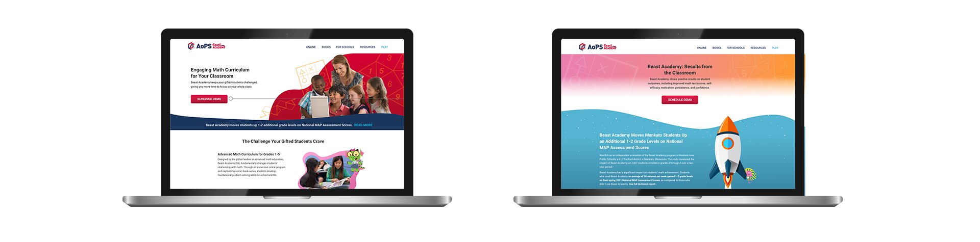
Turning dry material into something fun and tangible and wanting to keep the audience reading more, I chose to put emphasis on the study on the page. Using the image of a rocket (synonymous with high achievement) flying high, I felt it would lead the audience to this section immediately. Also, adding an animation on parallax of the rocket taking off as you scroll down was just the touch it needed. Other animations keep the audience on their toes and make sure their eyes do not miss the highlights of this study and truly understand how AoPS students across the board have higher test scores across the US.

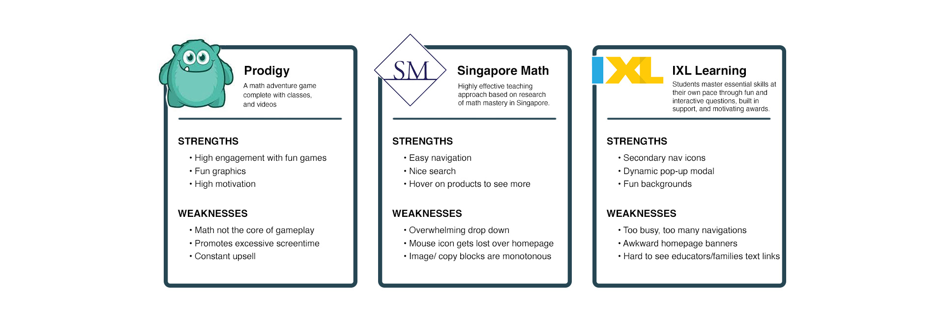
In my research, I found that internal stakeholders wanted the highly detailed and technical report case study to be translated in an easy to digest way with Beast Academy branding in mind.

Meeting with the BA sales team helped me better understand their highest priorities for these landing pages. They were:
After some analyzing, I wanted to make sure I incorporated some of those features in the design. The following features were:
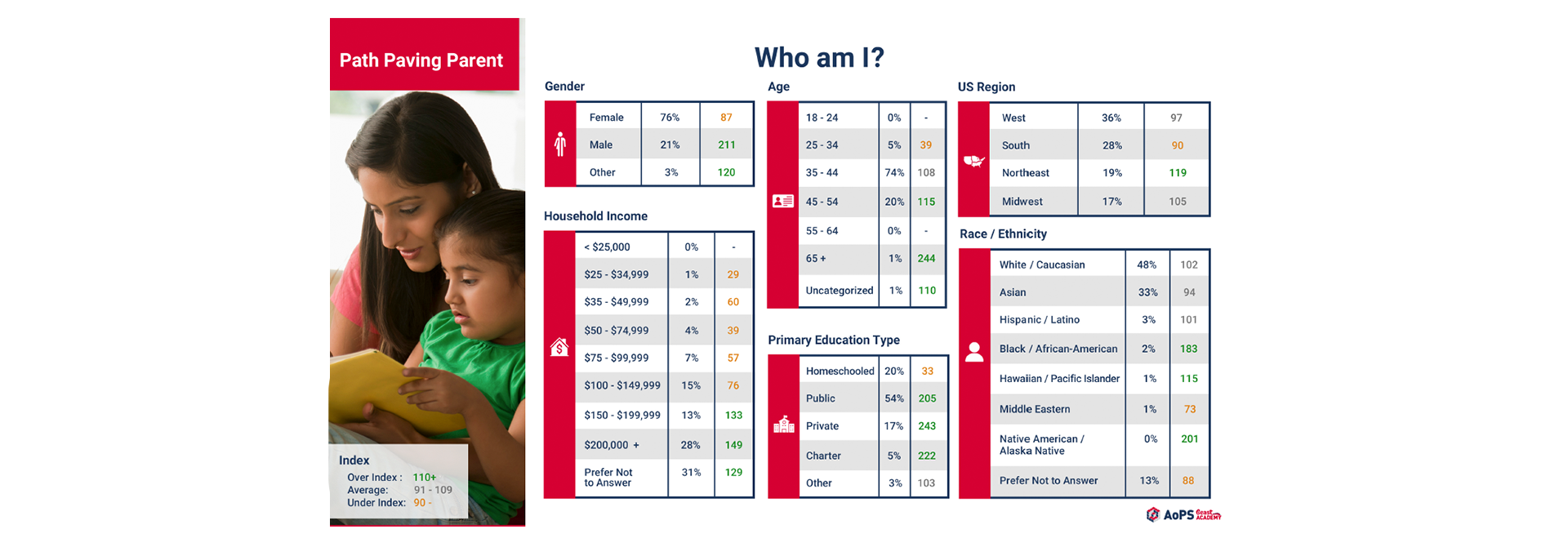
Through our in-house marketing research, we found that our main client client is the “path-paving parent”, moms 24-35 yrs old who are very involved in their child’s education and want the best for them.
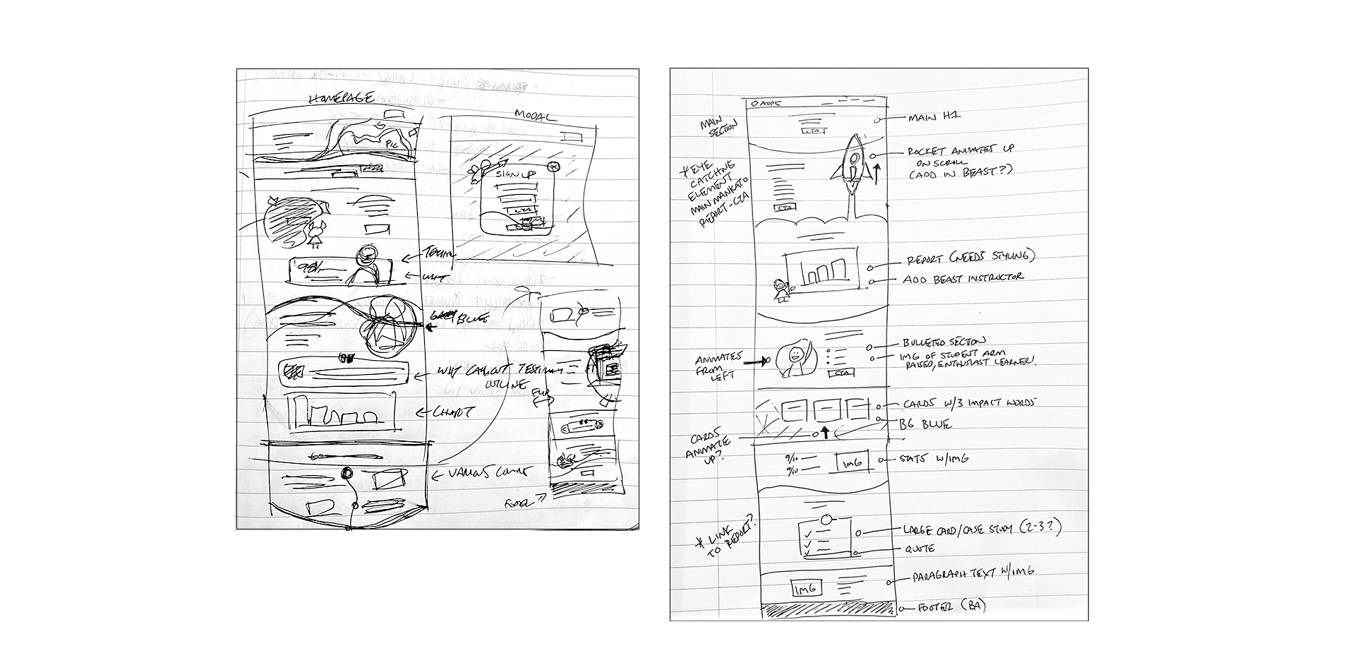
Once I identified stakeholders’ priorities, I began to layout the BA Welcome and Outcomes pages.
I started creating handdrawn low-fidelity desktop and mobile page wireframes, including notes for animation as I felt it would be a great addition to adding engagement.
A few key features included in these wireframes were:
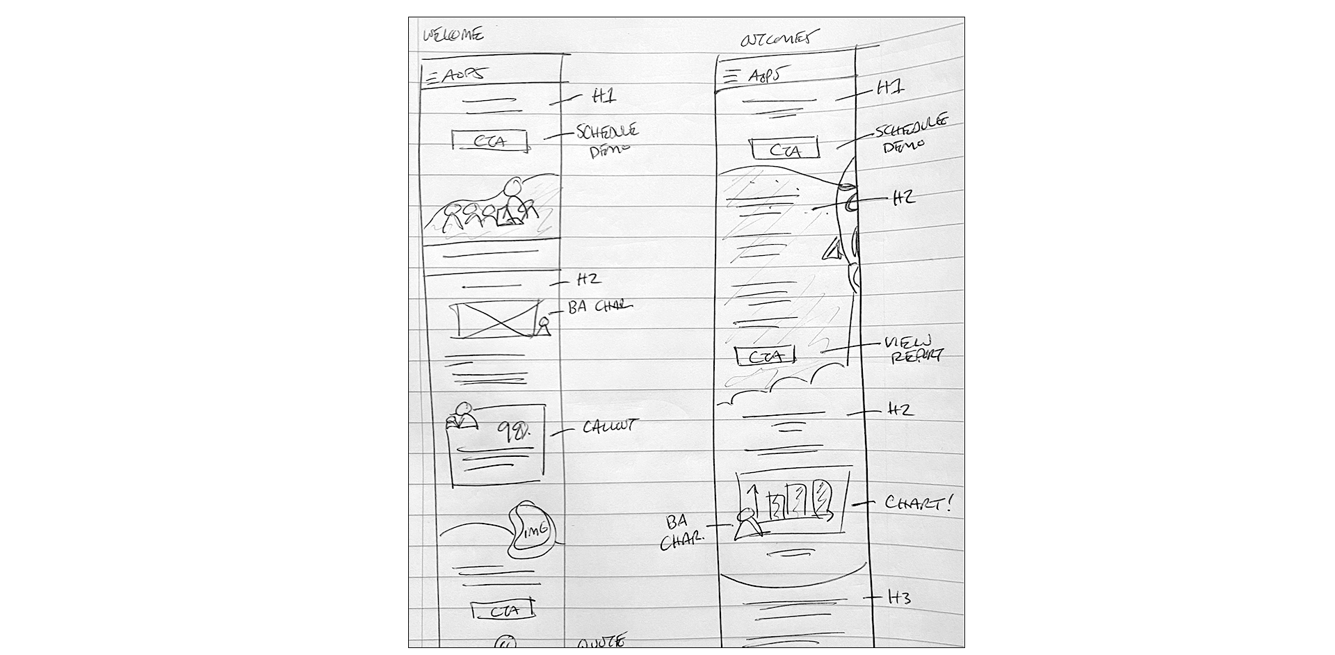
Same features as desktop, minus animations.

Desktop prototype was built and tested with users, I found that users could easily navigate through both pages.
After conducting usability tests, the following adjustments were made based on needs:
Familiarize myself with concepts from other departments
Interpolating intricate and data heavy information and chewing it up and spitting it out in a way anyone can understand was a true problem to solve. Making that data easy to digest and also engaging to look at was a whole other beast. Many meetings with stakeholders from the sales team about the study, having them break down the data for the average person to understand and then understanding what we wanted to do with that data to “wow” our parents rather than lose them in a sea of stats. When creating the new chart on the Outcomes page I grabbed all our most important information and broke it down and placed it within the graph in a way that was eye catching and easy to read in a split second. Adding in one of our beasts helps to support and encourage that fun learning aspect that Beast Academy brings. Overall, it was well received by stakeholders, internally within the company and a hit with our parents.